How to Make a Website Look Professional: 12 Essential Tips for a Polished, Trustworthy Site

First impressions online happen fast, within seconds! Your website needs to look professional, trustworthy, and easy to use from the moment someone lands on it. I’ve helped many women entrepreneurs improve their websites by focusing on the fundamentals: clarity, consistency, and user experience.
As a website designer who has helped dozens of entrepreneurs turn DIY websites into client-attracting, conversion-ready platforms, I can tell you: small details make a big difference. You can absolutely create a site that looks and feels professional without having to hire a full-time design team, but you do need to approach it with intention.
In this post, I’m sharing practical, easy-to-follow tips to help you make your website look professional, no matter your budget or tech skills, to avoid the common pitfalls of DIY web design.
Let’s get to it!
Key Takeaways
Start with a clear strategy: define your site’s purpose, ideal visitor, and the vibe that will attract them.
Keep your homepage minimal and focused with a clear headline, compelling image, and strong call to action above the fold.
Use clean, consistent layouts with plenty of white space to let content breathe and avoid clutter.
Choose high-quality, on-brand images, preferably professional photos or well-chosen consistent stock, to build trust.
Develop a cohesive color palette that speaks to your ideal client and supports brand emotions.
Write client-focused, scannable copy with clear calls to action on every page.
Ensure your site is mobile-friendly and performs well with fast loading times.
Build trust through storytelling, testimonials, and certifications.
Keep your website updated regularly to maintain professionalism and SEO health.
Know when to DIY and when to hire help for the best results and less frustration.
1. Start with Strategy, Not Just Style
Before you even think about colors or fonts, you need to be clear on what your website is meant to do. A professional site is more than an online business card, it’s a tool that should support your business goals.
Ask yourself:
What’s the main purpose of my site? (Book a call? Sell products? Showcase my work?)
Who is my ideal visitor, and what are they looking for?
What kind of style or vibe would attract them?
From my own process:
In my website design projects, I start every client off with a strategy session before we open a design program. We map out their client journey, key messaging, and site structure. Without this, even the prettiest site can feel aimless, and visitors could click away.
2. Keep Your Homepage Minimal and Focused
When someone lands on your site, they decide within seconds whether to stay or leave. That’s why the top part of your homepage, the “above the fold” area - is so important. The term comes from newspapers and refers to the section visible before you unfold the paper. On a website, it means the first screen visitors see without scrolling.
Donald Miller, author of Building a StoryBrand, says your website - especially the content above the fold - needs to pass the “grunt test.” In other words, are you clearly showing a visitor exactly what you do and how to buy from you? Could a caveman understand it in a few seconds?
Here’s what I always include above the fold:
A clear headline that says what you do, who you serve, and how you help.
A compelling image - ideally a professional photo of you or something that represents your business.
A strong call to action (CTA) that tells visitors what to do next, whether it’s booking a call or signing up.

Marie Forleo’s site features a big, bold headline above the fold that shows what she can do for you, an inspiring background video, and a clear main CTA: ‘Free Training.’
3. Choose a Clean, Cohesive Layout
A cluttered website packed with too many design elements is the fastest way to make it look amateurish. Professional sites keep things simple, with clear structure, plenty of breathing room, and a logical flow on every page. I often tell clients: less is more. Giving your content plenty of white space instantly elevates the whole look.
Tips for a polished layout:
Use consistent spacing between sections - let the content “breathe”.
Stick to 1–2 column layouts for most content. Avoid packing too much into one row.
Ensure text and images are aligned - misaligned elements instantly look sloppy.
Avoid “walls of text” with no formatting - break up content visually with short paragraphs and bullet points for easy scanning.
Use a good line length and generous margins - that means don’t let your text stretch all the way across the screen, it’s very difficult to read.

Each section on Frontier Climate uses simple column layouts to break up content, avoiding large blocks of text. Generous whitespace keeps the site feeling light and clean, even though it covers a weighty subject.
Client example:
I worked with a career coach who had DIY’d her site after a disappointing experience with a “designer.” When I first saw her homepage, content ran from edge to edge with no breathing room, and text blocks didn’t line up. It felt more like a wall of information than a welcoming introduction.
After refining her site with a consistent visual style, aligning every text block, and adding generous white space, the transformation was striking. Without changing a single word, her site went from cluttered and amateurish to polished and professional, exactly what you’d expect from a premium coaching brand.
4. Use High-Quality Images
Nothing screams “DIY” faster than pixelated, stretched, or images that feel like they don’t ‘belong’ together. Professional sites use high-resolution, well-lit, and on-brand images.
Consistent imagery can completely transform the look of your site. Even a simple Squarespace design will feel more polished when every photo shares the same style. Whenever possible, swap out stock photos for your own brand photography, people can spot generic images instantly, and they make your site feel less personal and trustworthy.
How to elevate your visuals:
Use custom brand photography whenever possible. If that’s not in the budget right now, see the pro tip below.
If using stock photos, choose a consistent style (light and airy, dark and moody, colorful and bold - pick one and stick with it).
Avoid cliché, overused stock imagery (like awkward handshakes or overly staged business meetings).
Pro tip:
The most impactful images are ones of you, your workspace, and real client interactions. They help visitors picture themselves working with you and create an immediate human connection. If professional photography isn’t in the budget yet, well-shot, bright images you take yourself will still show your style, personality, and brand far better than stock.
Resize images right: fast loading wins
Resize and optimize images for the web to ensure they load quickly without sacrificing quality. I use TinyPNG to compress images and convert them to WebP, a modern, lightweight file format that delivers faster loading times while maintaining great image quality.
5. Choose a Cohesive Color Palette
I always start color conversations by asking clients:
What colors are you drawn to?
What colors do you want to avoid?
And most importantly, what colors will attract your ideal client?
Sometimes a client’s favourite colors don’t match their brand’s target audience. For example, a child-focused business would usually use bright primaries or soft pastels, not subdued browns and blues.
Color sets the emotional tone for your brand. Choosing the wrong colors can send confusing signals, so I tie palette choices back to the feelings the brand wants to evoke.
I recommend tools like Coolors for generating harmonious palettes, and I use the ColorZilla color picker tool daily to pull colors from inspiring websites or Pinterest. If you don’t know where to start, Color Hunt has lots of popular palettes to browse.

Good Weather Skin uses a warm, vibrant red as an accent paired with soft neutrals for a balanced, modern, and inviting look.
Color tips for a professional feel:
Keep your color palette to 3–5 core colors (primary, secondary, accent, neutrals).
Make sure your colors have enough contrast for accessibility. Use this tool to check if your fonts and backgrounds have enough contrast to be legible. I see professionally designed sites make this mistake all the time - but accessibility should always take priority over aesthetics online.
Use your brand colors as accents. Not every section needs every color.
Client story:
One client came to me with a color palette and logo featuring six bright colors that clashed and didn’t suit her business’s tone. We narrowed the palette to two core brand colors plus neutrals, and updated her logo accordingly. Instantly, her branding transformed from amateur to polished.
6. Make Navigation Simple and Intuitive
Confusing menus are one of the top reasons visitors leave a website. Navigation should never confuse visitors. Around 75% of website redesign clients I work with have navigation menus overloaded with too many options or overly-complicated dropdowns.
Navigation rules:
Limit top-level menu items in your navigation to 5–6. Link to other pages within your content or in the footer.
Use clear labels (e.g., “About,” “Services,” “Contact”), avoid clever names that might confuse people.
Keep dropdown menus minimal.
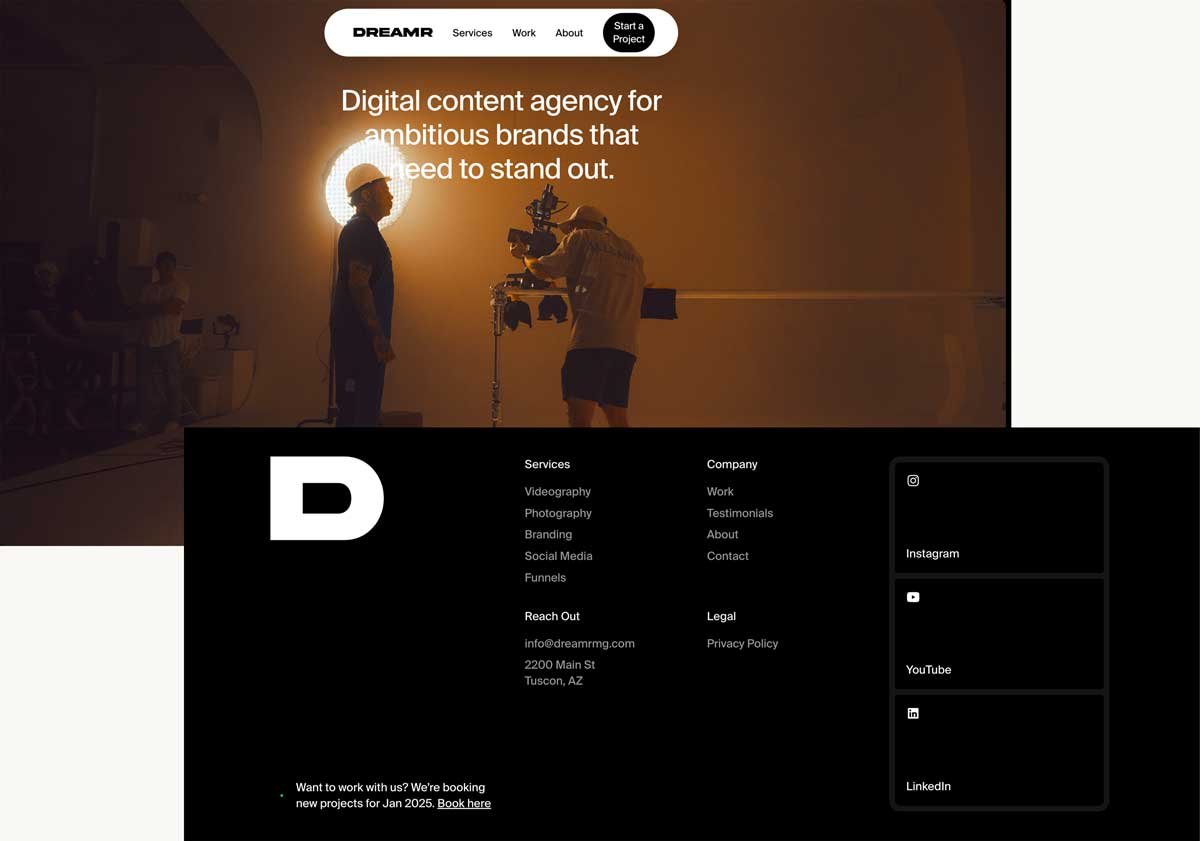
This content agency keeps its navigation streamlined with just three main menu options (plus a call-to-action), placing secondary links in the footer for a clean and focused user experience.
Client Example:
When I first saw a client’s site set for a redesign, the menu was cluttered and confusing, with scattered offerings that made it hard for visitors to find what they needed. After simplifying the menu and organizing everything into clear categories, the site became much easier to navigate.
The result? More sales and a smoother user experience.
7. Pay Attention to Typography
Typography can really make or break how professional a site feels. Some common mistakes I see are using too many fonts or inconsistent sizing that disrupts the visual flow. My personal pet peeve? Script fonts that are hard to read - they frustrate visitors and scream DIY.
I tend to lean toward modern, rounded serif fonts for headings paired with clean sans-serifs for body text. Fonts like Montserrat, Proxima Nova, or Gotham are great choices for body text.
Font size and spacing aren’t just about aesthetics - they also affect how easily your audience can read, scan, and absorb content. Good typography guides visitors toward the right actions while still looking great.
Typography checklist:
Use a clear, legible font for body text (avoid overly decorative fonts for paragraphs).
Limit yourself to 1–2 main font styles, one for headings, one for body text, and optionally one accent, used with a light touch.
Make headings bold and distinctive.
Maintain consistent font sizes and styles across pages.
Check mobile font sizing - what looks great on desktop can be tiny and unreadable on a phone.
8. Write Clear, Client-Focused Copy
Great design alone can’t make up for unclear or unfocused messaging. A professional website speaks directly to your ideal visitor’s needs, answering their questions and showing them how you solve their problems. Your words need to connect quickly and clearly, guiding visitors toward taking action.
Strong copywriting means:
Clear, benefit-driven headlines that immediately explain what you do, who you serve, and why it matters to them.
Calls-to-action (CTAs) on every page.
Avoiding jargon unless your audience uses it.
From my experience:
When I worked with a psychotherapist with over 35 years of experience, her main challenge was clearly communicating who she is and how she helps her clients. She had deep expertise but found it difficult to express it in a way that truly connected online. Together, we refined her messaging to speak directly to her ideal clients and let them know what to expect when they worked with her. The result was a clean, confident website that clearly conveyed her services and made it easy for visitors to understand how to get started.

9. Make It Mobile-Friendly
Over half of web traffic comes from mobile devices. A professional website is responsive, meaning its content adjusts in size and layout depending on the device, making it easy to use on any screen.
Check mobile previews using Squarespace tools and on your own devices. If your mobile site is broken or loads really slowly - you’re probably losing customers! Always design with mobile in mind from the start - not as an afterthought.
Mobile design essentials:
Check how your site looks on multiple devices to make sure the layout stays intact and nothing breaks.
Make buttons and links large enough to tap.
Prioritize Performance
Slow sites lose visitors fast. Test your page load times to ensure a fast, smooth experience. I use tools like PageSpeed Insights to identify speed issues, compress images with TinyPNG, and remove unnecessary animations.
I’ve learned from my own early websites that balancing beauty and speed is key. Recently, I’ve favored shapes, lines, and pleasing text layouts for visual interest over lots of large images or heavy videos.
10. Include Trust-Building Elements
Visitors want to know you’re legitimate before they hire you, so your Home and About pages need to tell a story that truly connects, not just read like a résumé.
To achieve this, I guide clients to include why they do what they do, what their values are, and how they help others, all while keeping the spotlight firmly on their clients’ needs.
Sharing some personal detail helps them feel human and relatable, building a stronger connection. From there, we build trust by clearly showing how their experience and training make them the best person to help solve their customers’ goals and problems.
Trust elements to add to your site:
Testimonials and reviews
Client logos or “as seen in” features
Certifications or qualifications
Professional photography of you and/or your team, and your work
Clear privacy policy and contact information
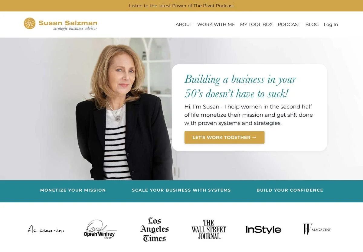
On Susan’s site, we put the “As Seen In” logo section high up on her home page to start building trust immediately.
Web designer tip:
Testimonials are non-negotiables for me when designing a site, and are essential for new businesses, because people trust the experiences of others. As soon as you start gathering positive feedback, make sure to sprinkle testimonials throughout your site, not just tuck them away on a hidden “testimonial” page.
11. Keep It Updated
Even a beautifully designed site can look unprofessional if it’s outdated. You can’t just build it and ‘ghost’ - Google will penalize you in search results. It doesn’t look good when you visit a business’s homepage and their latest “featured blog post” is years old.
Stay fresh by:
Updating copy and images regularly
Removing outdated services or promotions
Making sure links work
Reviewing your site at least every quarter
Designer advice:
I encourage all my clients to schedule a “website check-up” every three months. It’s much easier to fix small issues regularly than to overhaul an outdated site every two years. If you want some help keeping your site updated with fresh content, check out my Smart Site Support service.
12. Know When to DIY, and When to Get Help
You can absolutely make your own website look professional - but there comes a point where investing in expert help will save you time, frustration, and missed opportunities.
If you’re DIYing, focus on:
A clean, simple layout
Consistent branding
Mobile optimisation
Consider hiring help if:
You can’t get your site to look consistent, or feel “right”
You don’t have time to learn design best practices
Your site isn’t bringing in leads or sales and you don’t know how to fix it
From my own experience:
Many clients come to me after spending months or years trying to DIY. Once we work together, they realise how much mental energy a professional site frees up - they can focus on their business instead of wrestling with design.

Final Thoughts
Making a website look professional requires balancing strategy with aesthetics: it’s about creating clarity, maintaining consistency, and building trust. Begin by clearly defining who your ideal audience is and what you want your website to achieve. With that foundation in place, your design decisions will come together naturally. From there, the key is to stay consistent throughout every element of your site.
Whether you’re building from scratch or refining a DIY site, focusing on strategy, simplicity, and cohesiveness will help you create a professional site that confidently represents your business.
If you’re feeling overwhelmed, start small. Tackle one thing at a time - like cleaning up your fonts or swapping out your worst stock photo. These small, steady improvements add up, building momentum and polishing your site over time. Before you know it, you’ll have a website you’re proud to share and that your clients can trust.
Ready to get your site looking polished and client-ready without the overwhelm? Let’s chat. Book a free 20-minute call, and we’ll figure out your next best step together.

FREE DOWNLOAD
Struggling to make your website work for you?
Grab this free Website Health Check to uncover what’s working, what’s not, and how to fix it—without the tech overwhelm!

Hi, I’m Catherine.
I help female entrepreneurs and business owners confidently connect with their ideal clients with strategic design.